Summary
I redesigned Splunk's troubleshooting dashboard to consolidate scattered information across 8+ browser tabs into one unified view, reducing the time engineers spend diagnosing website crashes by 30%.
Situation: When every second costs money
When a website crashes or slows down, engineers race against time. Every minute of downtime means:
💸 Lost Revenue
E-commerce sites lose thousands per minute during outages
😤 Frustrated Users
Customers abandon slow sites and never return
🔥 Stressed Teams
Engineers under pressure to fix problems fast
The Business Context
Companies use Splunk's Real User Monitoring (RUM) to detect when their websites have problems.
Think of it like a security camera for websites—it records what real users experience and helps engineers find and fix issues quickly.
"A page won't load, but I have no idea how many users are affected or why it's happening. I'm opening tab after tab just to get basic information."
— Engineering Manager at Fortune 500 company
Challenge: Information Scattered Like Puzzle Pieces
I observed engineers during customer support sessions and discovered they were juggling multiple browser tabs like a circus act:

Opened multiple tab chaos - "8+ browser tabs to correlate basic metrics"
What I saw:
Engineers needed to answer 5 critical questions during a website crisis:
- How many users are affected? (Tab 1)
- How severe is the problem? (Tab 2)
- Which pages are broken? (Tab 3)
- Where are users located? (Tab 4)
- What changed recently? (Tab 5-8)
Each answer required switching tabs, remembering information, and mentally connecting the dots.
Key insights
The tool was powerful but overwhelming
Engineers had all the data they needed—it was just scattered across too many places.
Like having all the ingredients for a recipe spread across different rooms in your house.
Solution: One Dashboard, All Answers
Instead of making engineers hunt for information, I brought the answers to them.
1
Talked to right prople
• Since we couldn't talk directly to customers, I set up meetings with sales engineers who work with customers daily.
• They showed me real troubleshooting sessions and explained what engineers actually need.
2
Organized by role, not just data
• Different engineers need different information.
• A frontend engineer cares about page load times, while a backend engineer needs server data.
• I created role-based views so each person sees what matters to them first.
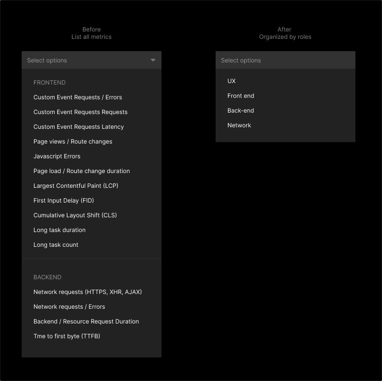
Before/After comparison
3
Reused what already worked
• Since we couldn't talk directly to customers, I set up meetings with sales engineers who work with customers daily.
• They showed me real troubleshooting sessions and explained what engineers actually need.
Design principle
• Show the "what" and "who" immediately, then let engineers drill into the "why" and "how" when they need it.
• Progressive disclosure instead of information overload.
Results: Time Saved, Stress Reduced
30%
Faster troubleshooting
8 → 1
Brower tabs needed
Beyond the numbers
Customer Excitement
During demo sessions, customers asked when they could use the new dashboard before we even announced a release date. Some said "this is exactly what we've been waiting for."
Better Decision Making
Engineers could see the full picture immediately—no more guessing which problem to fix first or missing critical context.
Reduced Cognitive Load
Instead of remembering information across multiple screens, engineers could focus on solving the actual problem.
The Human Story
Meet Sarah, Site Reliability Engineer:
Before: "At 3 AM when the site goes down, I'm half-awake, opening tabs, trying to remember where I saw that metric five minutes ago. By the time I figure out what's wrong, more customers are affected."
After: "Now I open one dashboard and immediately see: 2,000 users in Europe can't checkout, it started 10 minutes ago, and it's related to a deployment we made yesterday. I can focus on fixing it instead of playing detective."
Lessons Learned
Good design isn't about making things look pretty—it's about understanding how people actually work and removing friction from their day. When engineers can troubleshoot faster, websites stay online longer, companies lose less money, and users have better experiences.
The lesson
Sometimes the best design solution isn't adding new features. It's reorganizing what you already have to match how people naturally think and work.