My story in one sentence
I transformed a 6-hour technical workflow into a 5-minute self-service experience, expanding our monitoring tool from developers-only to everyone—and captured first-to-market advantage.
Situation: The Adoption Blocker
Splunk's website monitoring tool required engineers to spend 6+ hours manually creating tests—inspecting HTML, finding code selectors, copying them one by one. Only technical users could use it.
Think of it like: Requiring everyone to be a mechanic before checking their tire pressure.
The opportunity: Chrome released a Recorder tool (like hitting "record" for website actions). No competitors had integrated it yet.
"I need to monitor checkout, but I'd have to bother engineering every time something changes. We just... don't."
— Product Manager, Fortune 500 retailer
BEFORE: Manual Test Creation
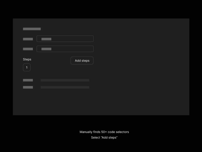
The Manual Process
• Engineer inspects website elements in browser
• Manually finds 50+ code selectors
• Copies each selector into test builder one by one
• Repeats entire process for every website change
⏱️ Time: 6 hours per test • 👤 Users: Developers only
AFTER: Chrome Recorder Import
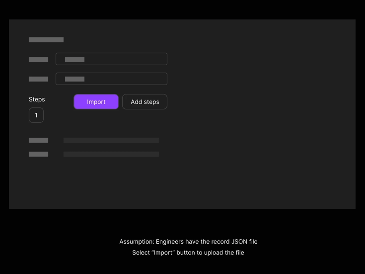
The Streamlined Process
• Engineer inspects website elements in browser
• Click Record in Chrome browser
• Perform actions naturally on website
• Export recording fileImport to Splunk → Done
⏱️ Time: 5 minutes per test • 👥 Users: Everyone on the team
Challenge: Speed Without Confusion
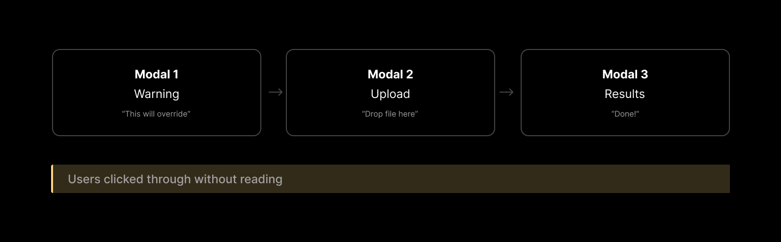
I needed importing to feel instant while ensuring users understood what was happening. I prototyped the full workflow in Figma to put myself in users' shoes—the original 3-modal design felt annoying to click through, revealing the friction before we built it.
Problem 1: Too Many Approvals
Original design: 3 modals (Warning → Upload → Results)
The issue: Like airport security asking "Are you sure?" three times—users stopped reading. When I prototyped and clicked through it myself, the repetitive confirmations felt exhausting.
My solution: 2 strategic modals
Original: 3 Modals (Too Much Friction)
Final: 2 Modals (Streamlined)
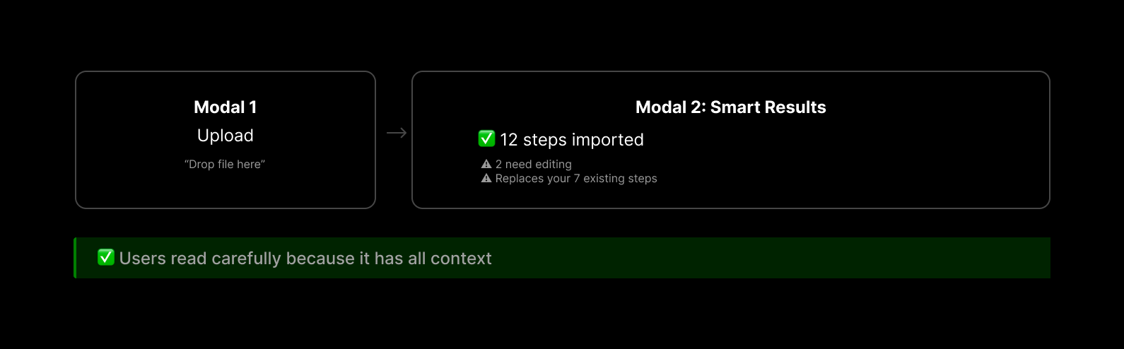
Why it works
One decision point with full context, not two blind approvals. I prototyped micro-interactions for the success state—a subtle checkmark animation—to create a moment of delight when the import completes.
Validation
Conducted moderated usability tests with 5 internal users, analyzing task completion and friction points. 100% preferred the streamlined flow, with one user noting "I actually read the confirmation this time because it had all the info I needed."
Problem 2: "Override" Confused New Users
Users starting a new test saw "This will override steps" and thought: "What steps?"
The psychology: It's like "Save" vs. "Save As"—same action, different feelings.
My solution: Context-aware messages based on user's situation
Scenario 1: New Test (No Existing Steps)
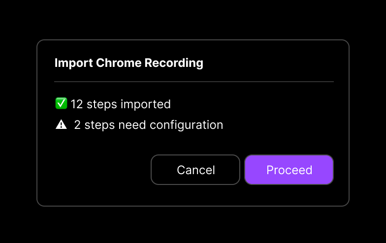
No scary "overwride" languge - friendly and clear
Scenario 2: Existing Test (Has 7 Steps)
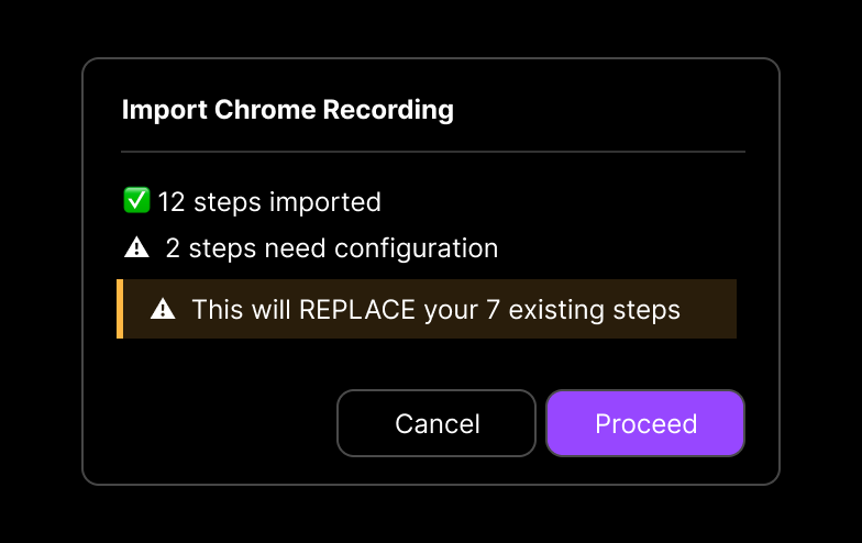
Clear warning with specific detail about what will change
How I convinced stakeholder
The prototype made the problem visceral—PM clicked through the new-test scenario and immediately said "Oh, I see the confusion." Data from usability tests sealed the decision.
Smart design decision
URL auto-extraction
Instead of forcing manual entry, backend pulls it from Chrome's file (one less field, zero confusion)
Specific errors
Not "some steps failed" but "Steps 3, 7, 12 left blank due to unsupported types"—like your car saying "rear left tire low" vs. just "check engine"
Phased launch
• Shipped core fast to capture market timing.
• Added advanced features in V2 based on real usage, not assumptions.
Results
96%
Faster
6hrs → 5 mins
85%
Adoption
Within 3 months
50%
Faster POC
14d → 7d
Market Expansion: 10 users/org → 100+ users/org
Support Tickets: 40% reduction in selector-related questions
""I closed 3 deals in Q1 showing this feature."" — Sales Engineer
Lessons Learned
Prototypes reveal what words can't
Experiencing the 3-modal flow myself made the friction obvious before coding a single line
Data resolves debates
Usability testing ended stakeholder hesitation instantly
Systems thinking wins
Understanding Chrome's data structure revealed better solutions than UI band-aids
Context > consistency
Same button, different messages based on situation = smarter UX
Why This Matters
Great design removes friction. By reducing a 6-hour task to 5 minutes, we didn't just save time—we expanded who could do the work. That's transformative.