Case Study
45% of riders still struggle to navigate BART.
Redesigning wayfinding so riders stop getting lost.
Total trips
4.15M
BART is a critical transit system for
162K+ daily riders
Helping commuters get to
Work, school, and home
Problem
45% of riders still struggle with navigation.
- Missed stops, wrong trains, and unclear exits waste time.
- Confusion creates anxiety, especially for new or occasional riders.
- Unintuitive wayfinding discourages people from choosing public transit.
This isn't just an inconvenience — it's a trust issue.
Reduced ridership growth
Higher car dependency
Increased traffic congestion
Research
Why is navigation so difficult?
I rode BART 15+ times over 3 weeks, documenting every moment of confusion. From Fruitvale to Embarcadero, I photographed signs, timed how long decisions took, and watched where other riders hesitated.
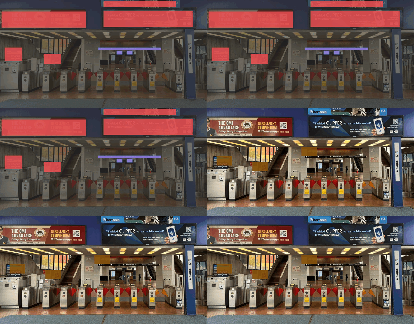
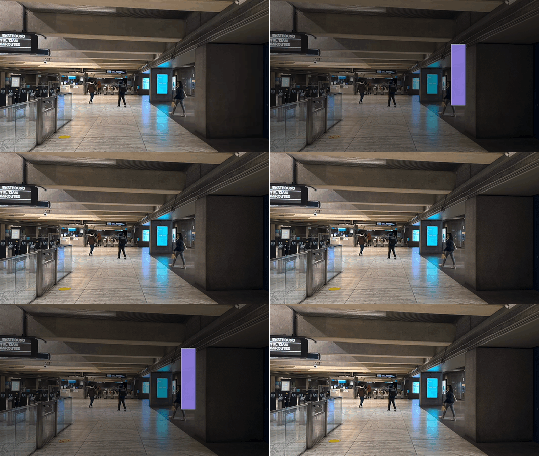
Many ads are distracting, and the signage is tiny.
Lack of onboard navigation support


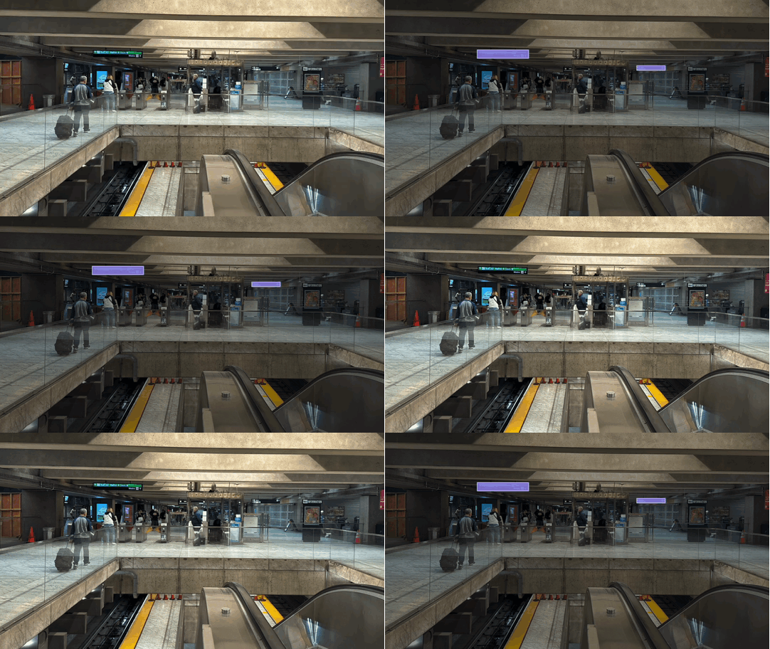
Poor exit signage wastes time
New riders and tourists struggle the most, relying on trial and error to find the right way out. Over 4.15 million trips per month, yet exit labels are unclear, inconsistent, or missing at key stations.

Inspiration
How to make BART more intuitive?
To address these issues, I designed a wayfinding system that enhances clarity, confirmation, & consistency.
Inspired by the best transportation systems
I studied transit systems that do wayfinding well — NYC's subway, Tokyo's rail system, and London's Underground.

Testing
I tested with real riders.
I tested paper prototypes with 5 riders at Embarcadero station. The numbered system clicked immediately — one rider said, “Wait, that's it? Blue line, stop 12?”
I interviewed 3 riders about their worst BART moments. One rider told me:
“BART feels a lot riskier because the maps aren't as clear, it's a lot less efficient (it takes me like an hour to get to Fruitvale Station from Walnut Creek!) and the trains come much less frequently, so if you miss a train or get on the wrong one, you're screwed.”
— Ch.
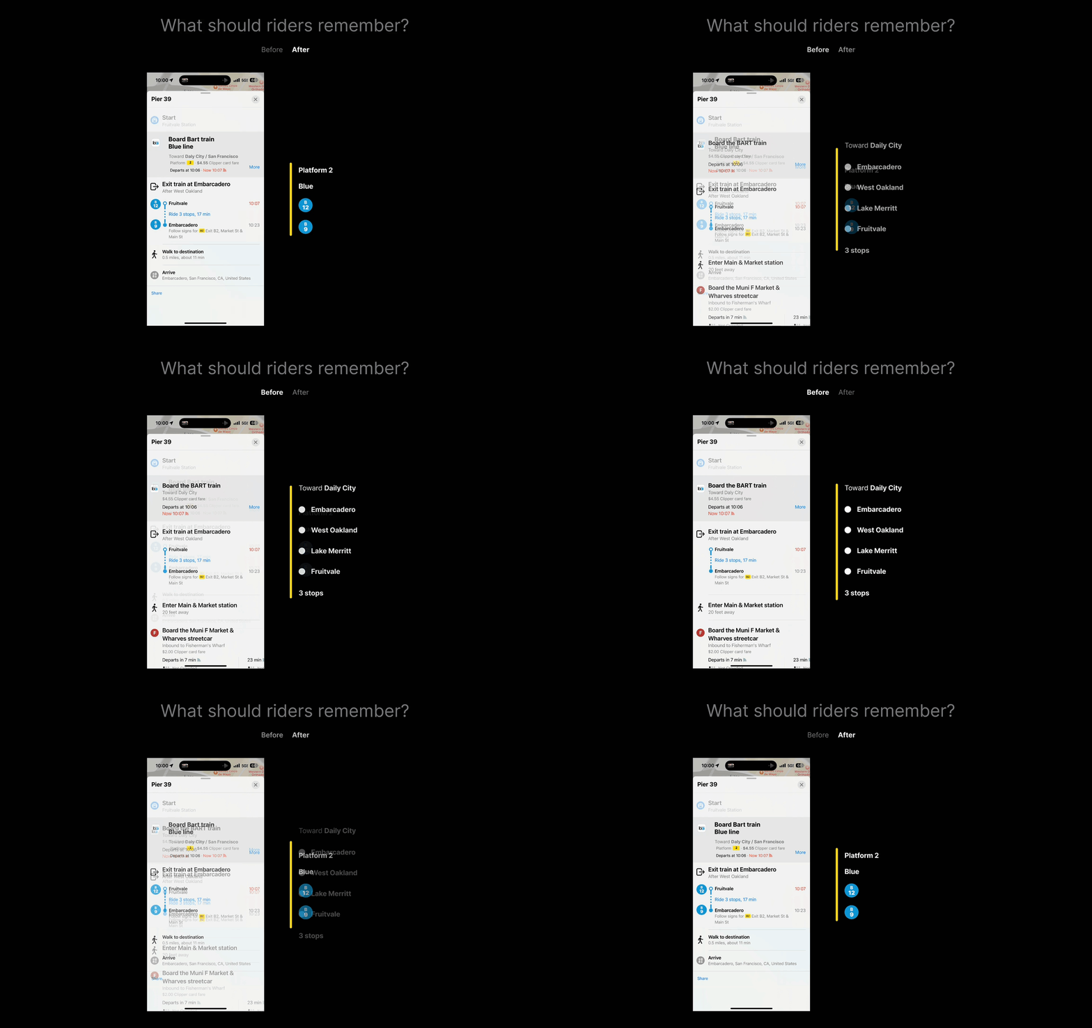
“Which platform? Which train? One look.”
Solution
Colors tell you which train. Numbers tell you which stop.
Station names are hard to remember. Numbers aren't. Now riders just need to know: Blue line, stop 12.
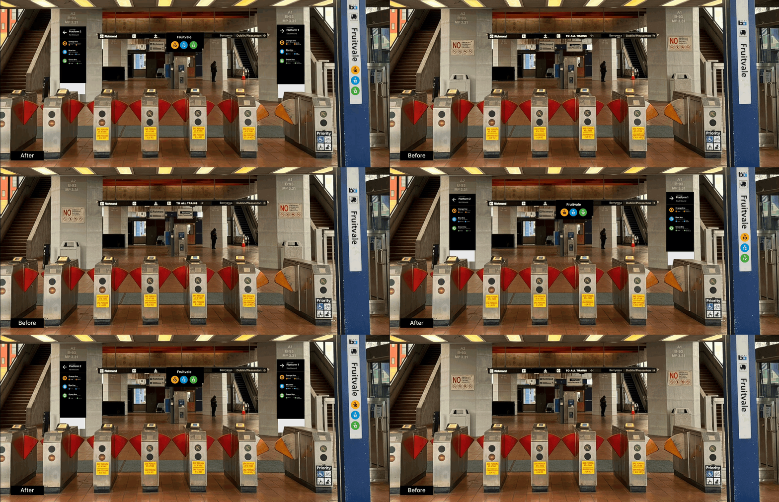
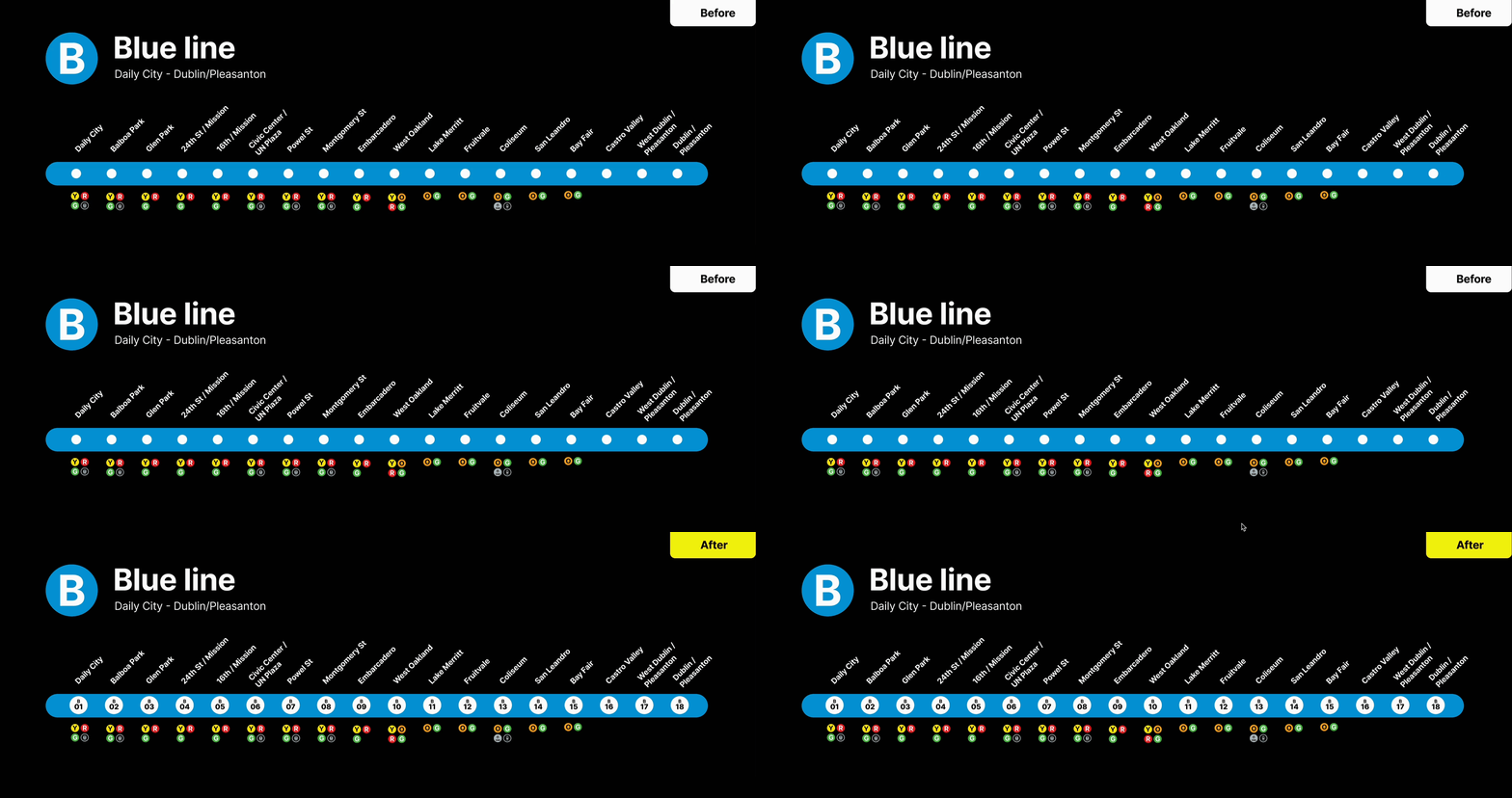
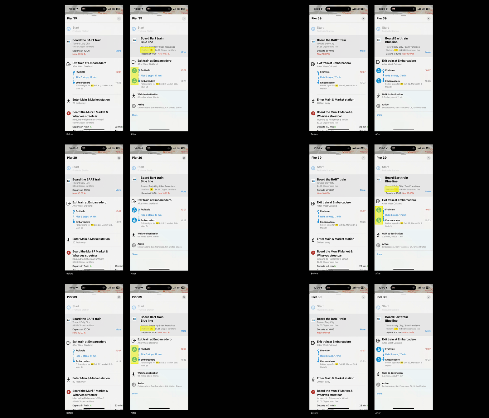
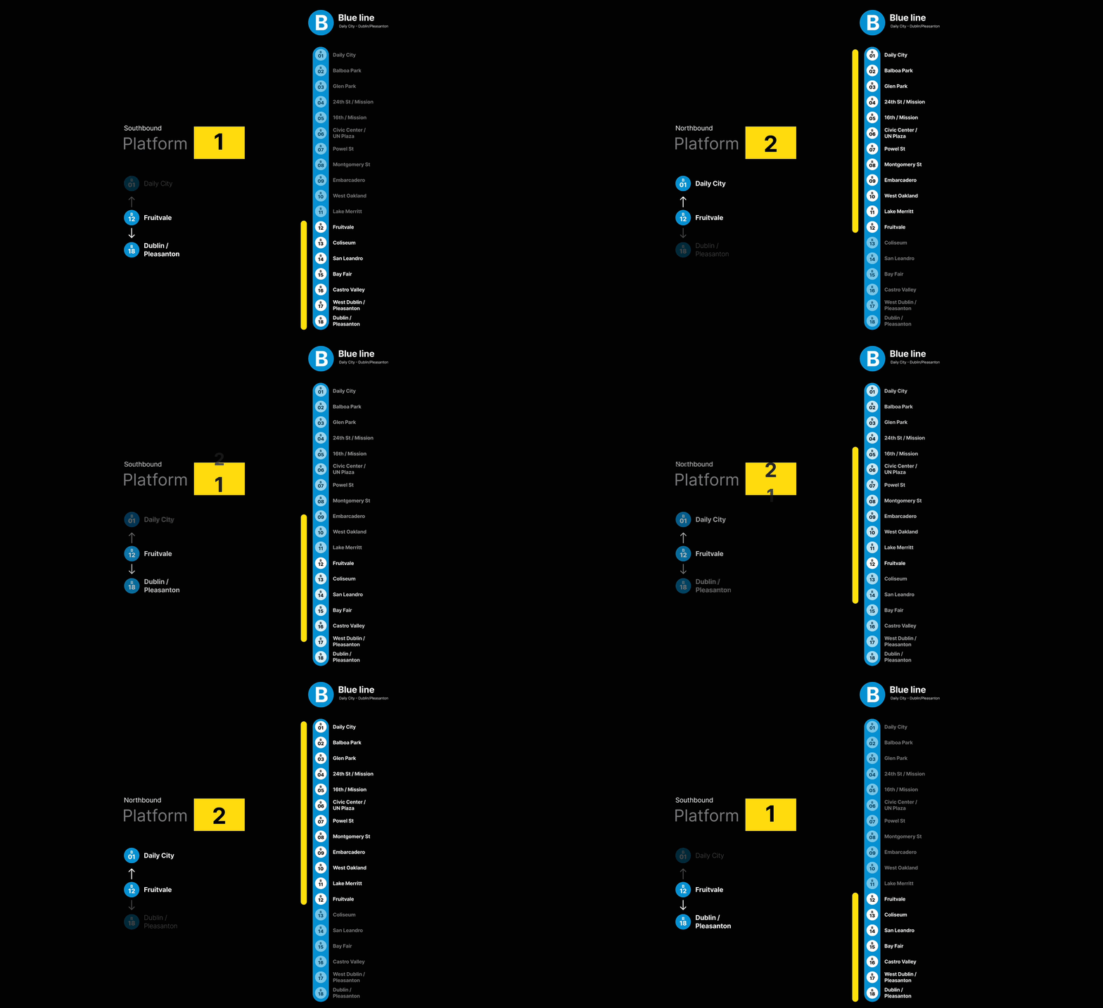
Good wayfinding doesn't just prevent missed trains. It makes people trust public transit again.
Outcome
Making transit trustworthy.
I redesigned BART's wayfinding so riders know exactly where to go — before they even step on the platform.
